My Role:
Project Manager
UX Designer
UI Designer
UX Researcher
SAIL: Weather for the Water
If the focus is wholly on the human, the product will show it.
The focus for Sail was on water lovers, specifically water sport lovers. Through user interviews, surveys, A/B testing, SWOT analysis and more, it was found that the main frustrations lied in the fact that users had to check multiple apps to find the answers that all, now, conveniently lie within Sail.
The problem I'm looking to solve is the ability for water sport lovers to have all the information they need in one place - No more using Google to search for places to rent a kayak, no more checking another app for the weather, and a third search for safety/emergency services near by.
Timeline:
Overall: 6 months
Discovery & Research: 3 months
Design & Testing: 3 months
Tools:
Figma
UsabilityHub
Figma.com
Sketch
ProCreate
1
Discovery
Competitive Analysis
User Research
2
Define
Affinity Mapping
User Personas
My Design Process
3
Information Architecture
User Flows
User Journeys
Site Mapping
4
Ideate
Sketches
Wireframes
Low-Fidelity Prototypes
5
Develop
Usability Testing
Preference Testing
Iterations
Mid-Fidelity Prototypes
High-Fidelity Prototypes
6
Deliver
Style Guide
Pattern Library
Screens
Check out the full prototype here
Discovery
Discovery
Throughout the discovery phase, I conducted competitor analysis followed up with in-depth user research. During the competitor analysis, I was able to gain insight into best and worst practices for weather apps. User research helped uncover hidden problems and inconveniences in users’ day-to-day weather apps.
Buoyweather
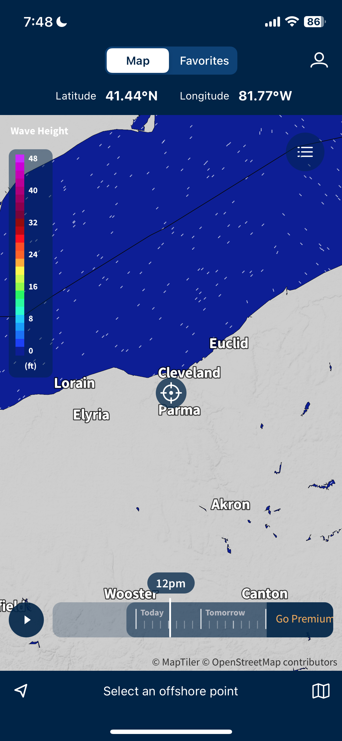
Without being able to see and compare all the weather conditions in one place, it was difficult to remember all the different data points for different hours of the day.
Strengths
Buoyweather is an excellent app as it tracks core data such as wave height, wave period, wind, sea temperature and bathymetry, among others. What sets this app apart from others in the market is the quality of the maps – as data type is changed, so does the map, creating a great visual for those too busy for large amounts of data. With so few navigational tabs/buttons, Buoyweather is a very simple, yet highly functional app.
FishWeather
Competitor Analysis
Weaknesses
Buoyweather, while giving a similar user experience to Google Maps or The Weather Channel, does not offer graphs or data charts to list out the various weather factors on one page. Without being able to see and compare all the weather conditions in one place, it was difficult to remember all the different data points for different hours of the day. There is also no opportunity to get notifications from the app, which could be a great change for extreme weather alerts, etc.
Opportunities
Users should not have to choose between visual or written data. Water safety cannot be up to interpretation and Buoyweather has a great opportunity to expand the look of its home screen. The entire display is all map while forecast is another screen. This may bridge the gap between those looking for visuals vs. numbers. Buoyweather.com takes no advantage of the larger screen, which could easily display both written data and an interactive map.
Threats
Buoyweather, though only ranked #157 in the US app store, is spoken highly of on various boating and water safety sites. However, other websites/apps that threaten Buoyweather are #138 FishWeather, #83 Marine Weather Forecast Pro – which tracks and charts conditions in 10 minute increments.
Free features are confusingly intermixed with the Pro features, specifically the tabs in the menu. The Plus/Pro tabs should be in a separate section of the app.
Strengths
FishWeather offers a wide variety of data and analytics, most of which cannot be viewed without a paid subscription. The wind maps are super interactive, are clear and easy to read. Having started as a .com format, with so much data driven and aimed for fishermen and distance sailors, the data is highly technical and detailed.
Weaknesses
FishWeather has so much amazing data, as a new user, I have no idea how to read or interpret it. The menu is confusing and out of order. This website/app used to be free, with hundreds of thousands of users all over the world, and has since implemented its’ monthly subscription service, turning off many of it’s loyal fans leaving negative reviews for that reason.
Opportunities
Free features are confusingly intermixed with the Pro features, specifically the tabs in the menu. The Plus/Pro tabs should be in a separate section of the app. With essentially every other tab being a Plus/Pro feature only, it’s unclear what I, as a non-paying user, can use and access in a pinch when needing weather/water updates.
Threats
FishWeather has seen a drop in users over the last 5 years due to its subscription charges. With this comes a drop in the App Store Rankings around the globe. Windy.com is also quickly becoming a go-to weather app, next to the number one, The Weather Channel.
Insights Gained Through Competitor Analysis
Core Opportunities
Users should not have to choose between visual or written data. Water safety cannot be up to interpretation and there is a great opportunity to expand the look of home screens.
An entire display is all map while forecast is on another screen - this may bridge the gap between those looking for visuals vs. numbers.
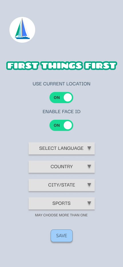
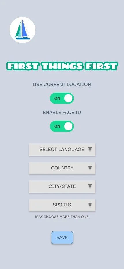
Having too much data can be overwhelming for those unfamiliar with marine data – adding an onboarding process to walkthrough the app.
Ability to click on a data point and be shown the abbreviation in full.
There is also no opportunity to get notifications from all the apps, which could be a great change for extreme weather alerts, etc.
User Research
Through user interviews and online surveying, I was able to collect valuable and insightful data on user pain points and preferences. This data influenced all the design choices throughout Sail, ensuring safety and accuracy is at the forefront.
Target Audience for Sail
Families: One of the major target audiences for Sail are families spending days on the water or beach. With safety at the head, fun and sports add to the efficiency of the one-stop-place for
Water-Aficionados: Lovers of all things beach and water are our key target demographic.
Athletes: Athletes and water sport lovers are the core targets for Sail. Key features of the Sail app offer safety tips, locations and closest hospitals.
Insights Gained Through User Interviews
Donte
AGE 28
LAKEWOOD, OHIO
PROFESSIONAL MOVER
Interviewees
Veronica
Radars and simple data stacks are most useful
Wind speed affects all days on the water, no matter the sport or occasion
Weather apps used, no apps specific to sailing, water activities, etc.
Begin checking the weather up to 4 days ahead of time
Wave heights exceeding 3 feet are a major contributor to cancelling days on the water
Marty
General Frustrations
Inaccuracies
Thick data stacks
AGE 72
MENTOR, OHIO
RETIRED FIREFIGHTER
AGE 35
CLEVELAND, OHIO
BARTENDER & EMERGENCY
MEDICAL TECHNICIAN
General Behaviors/Attitudes
Check weather days before time spent on the water
Different water vessels used
General Needs/Goals
Safety first
Simplicity
Water safety measures/suggestions
Surface temperature
Accurate forecasts
“I don’t do anything without checking the weather first.”
-Veronica, Interview Response
Define
Define
During the Define stage of the project, the data collected throughout my user research was then reorganized to make the more sense of the information collected. Using affinity mapping, key patterns were grouped together. This process led to the creation of user personas. These user personas helped to understand and generalize the overall needs, goals and paint points of our target users.
Below are the two main user personas used throughout the research process for SAIL, Charlie and Abby. There’s Charlie, the busy, doting, dad of 3 that loves to take his kids to the water any chance he gets. And there’s Abby, the new mom with a water-loving family that relies on apps and safety tips to keep the whole family safe on the water.
Information Architecture
Information Architecture
During the information architecture phase of the project, the user personas created were used to help develop the user journeys and flows. With the user journeys and user flows, initial site maps were created to help outline the overall shape of Sail. Additional insights from cart sorts were able to improve the structure of Sail.
Ideate
Ideate
1
Paper Sketches
6
User Feedback & Preference Tests
2
Low-Fidelity Wireframes
3
Mid-Fidelity Prototypes
7
Material Design Iterations
4
Usability Testing
8
Peer Review
5
User Satisfaction Surveys
9
High-Fidelity Prototypes
Develop
Develop
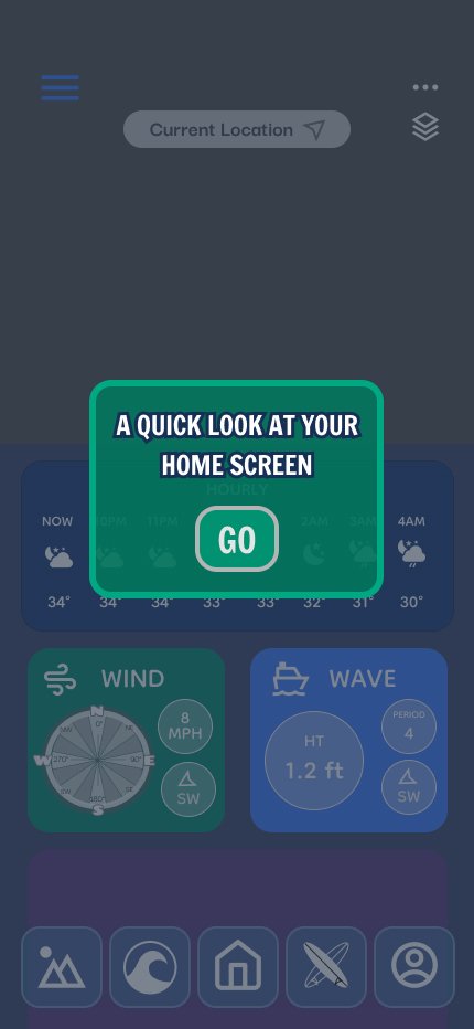
During the development phase of the project, mid-fidelity prototypes were developed and usability testing was conducted. Using the data collected from the usability testing, new design iterations were designed. As. high-fidelity prototypes were created, preference testing was conducted to test the overall look and design of Sail.
Mid-Fidelity Prototypes





Usability Test Results
Issue 1: Need for clearer difference between home screen and tabs
When asked to find specific wave information (Lake Erie water temperatures), one user did not look for lake temperatures in the sea tab, assuming it is a different thing altogether. Two users took too many extra seconds to find the lake temperatures after finding wind data.
Suggested Change – First, clearer labeling during onboarding can explain how home widgets are meant to be simple and less detailed whereas the tabs are meant to show further details and data. Secondly, make sure home widgets do not contain too much information or the tabs become useless.
Issue 2: 10-Day forecast did not grab attention quickly nor make immediate sense
When tasked to plan for the coming weekend, three users did not find the information easily, and one user wasn’t sure if the temperatures were in Fahrenheit or Celsius.
Suggested Change – First, showing day and night icons at the same time to stop any confusion when planning for events days ahead of time. Second, adding an option during onboarding for users to choose their preference, Fahrenheit or Celsius. Thirdly, have the 10-day be a pop-up widget, showing further detail for the week ahead as well as making the font larger for those who need it.
BEFORE
AFTER
Issue 3: Safety information was not where participant expected
Though only three of the six participants were tested on this scenario, all three failed to find the information easily. When tasked to find specific safety information (nearest hospital), all three participants needed to search through each of the five tabs to find the information, eventually finding it in the sports tab.
Suggested Change – First, clearly label during onboarding or in the tab label/icon itself that the tab is a Sports and Safety tab as opposed to just a sports tab. Second, consider putting a red cross in each tab because, as stated by a test participant, “in an emergency there’s no time to think.” Thirdly, add local places to participate in the sports listed in the tabs.
Design Iterations


Deliver
Deliver
High-Fidelity Prototype Screens
The above high fidelity screens are the direct result of usability and preference testing.


